The search for a style in home decoration that is both aesthetic and heartfelt inspired the creation of Casa Alegre.
The search for a style in home decoration that is both aesthetic and heartfelt inspired the creation of Casa Alegre.
Casa Alegre set out as a brand aiming to bring a fresh perspective to the home décor market. The goal was to create a brand language that carries high aesthetic value yet feels warm and inviting. Here, luxury was to be defined not only by form but also by emotion.
Casa Alegre set out as a brand aiming to bring a fresh perspective to the home décor market. The goal was to create a brand language that carries high aesthetic value yet feels warm and inviting. Here, luxury was to be defined not only by form but also by emotion.
A New Definition of Luxury
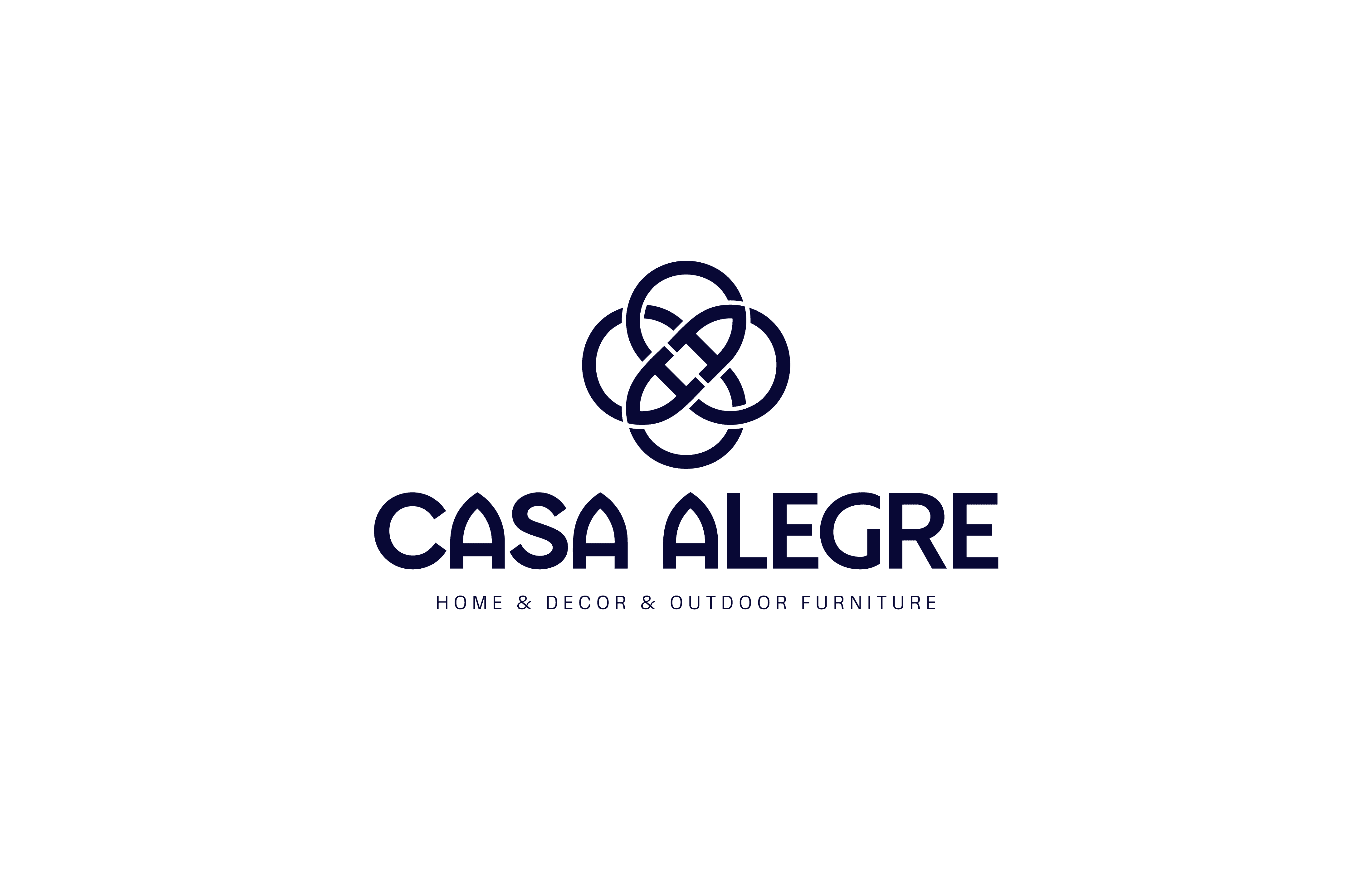
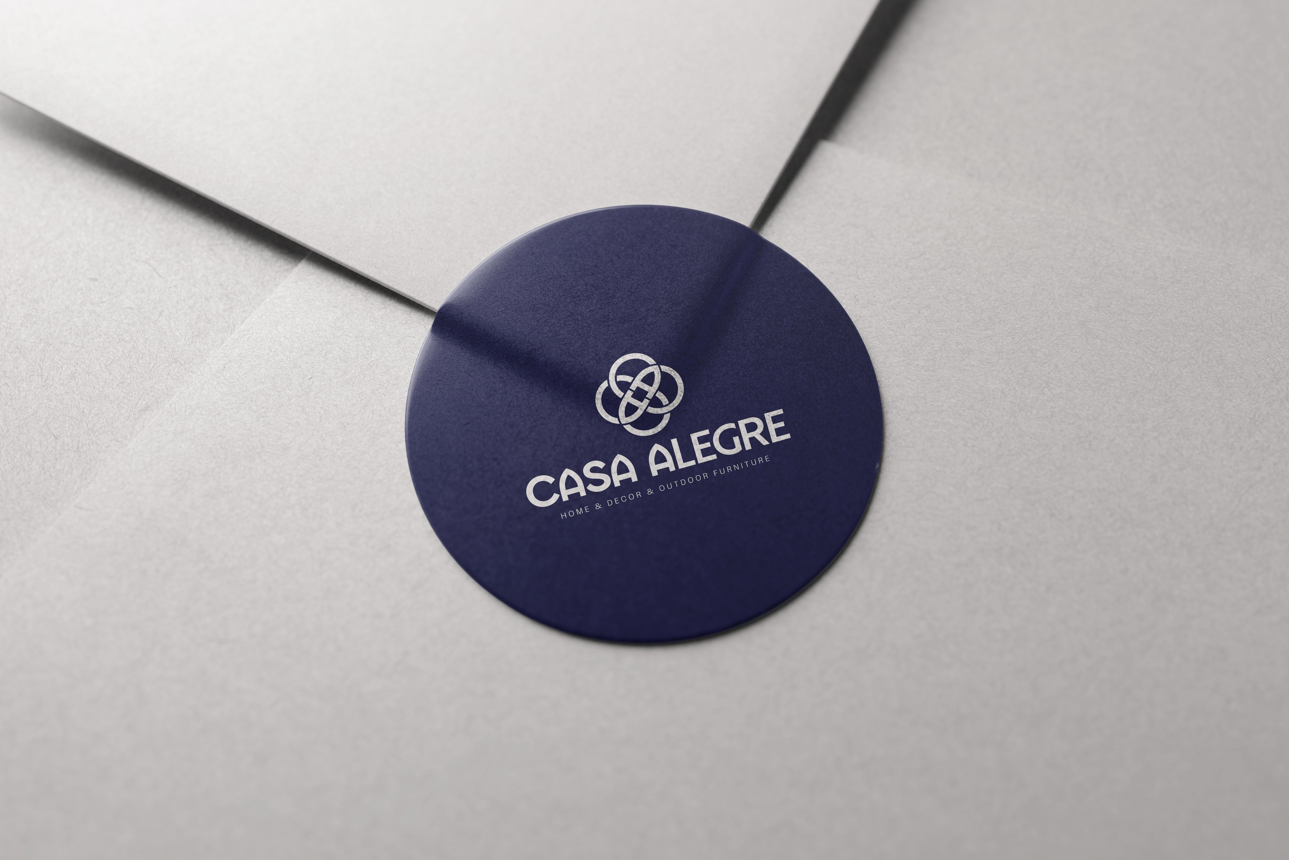
Casa Alegre is not just a luxury home décor brand; it is also a special brand aiming to create an inviting experience. We embodied this vision in an identity that is timeless yet warm, sophisticated yet approachable. The symbol formed from the letter A was placed at the heart of the brand as a simple and memorable representation of this balance.
Inspired by the meaning carried by the brand’s name, we built its identity around a “feeling of happiness.” The symbol formed by the merging of letters both creates visual memory and represents the brand’s name with simple elegance. The chosen dark navy color reflects weight and trust, while the selected typography and use of space convey a refined, breathable world for the brand.
A New Definition of Luxury
Casa Alegre is not just a luxury home décor brand; it is also a special brand aiming to create an inviting experience. We embodied this vision in an identity that is timeless yet warm, sophisticated yet approachable. The symbol formed from the letter A was placed at the heart of the brand as a simple and memorable representation of this balance.
Inspired by the meaning carried by the brand’s name, we built its identity around a “feeling of happiness.” The symbol formed by the merging of letters both creates visual memory and represents the brand’s name with simple elegance. The chosen dark navy color reflects weight and trust, while the selected typography and use of space convey a refined, breathable world for the brand.

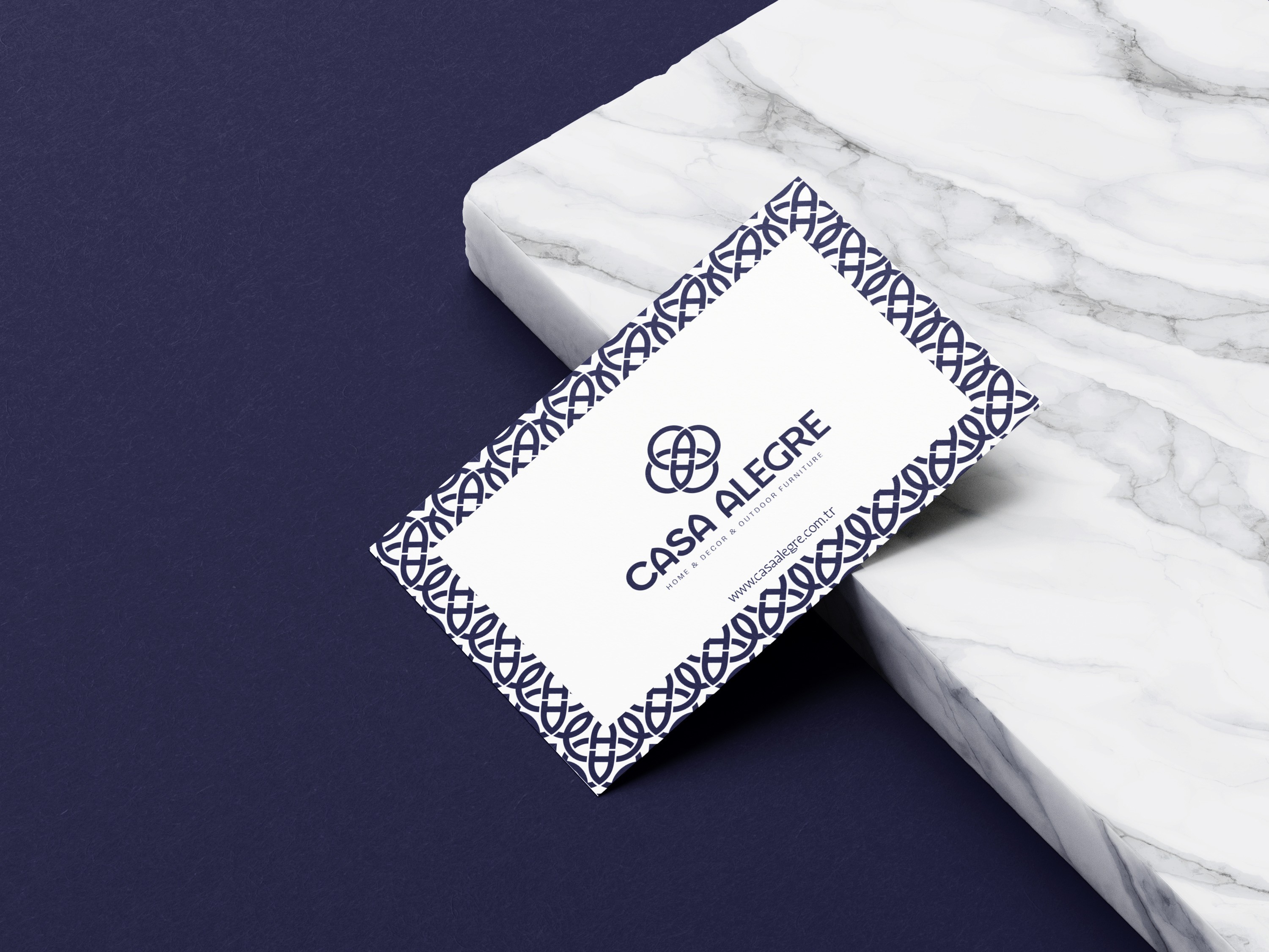
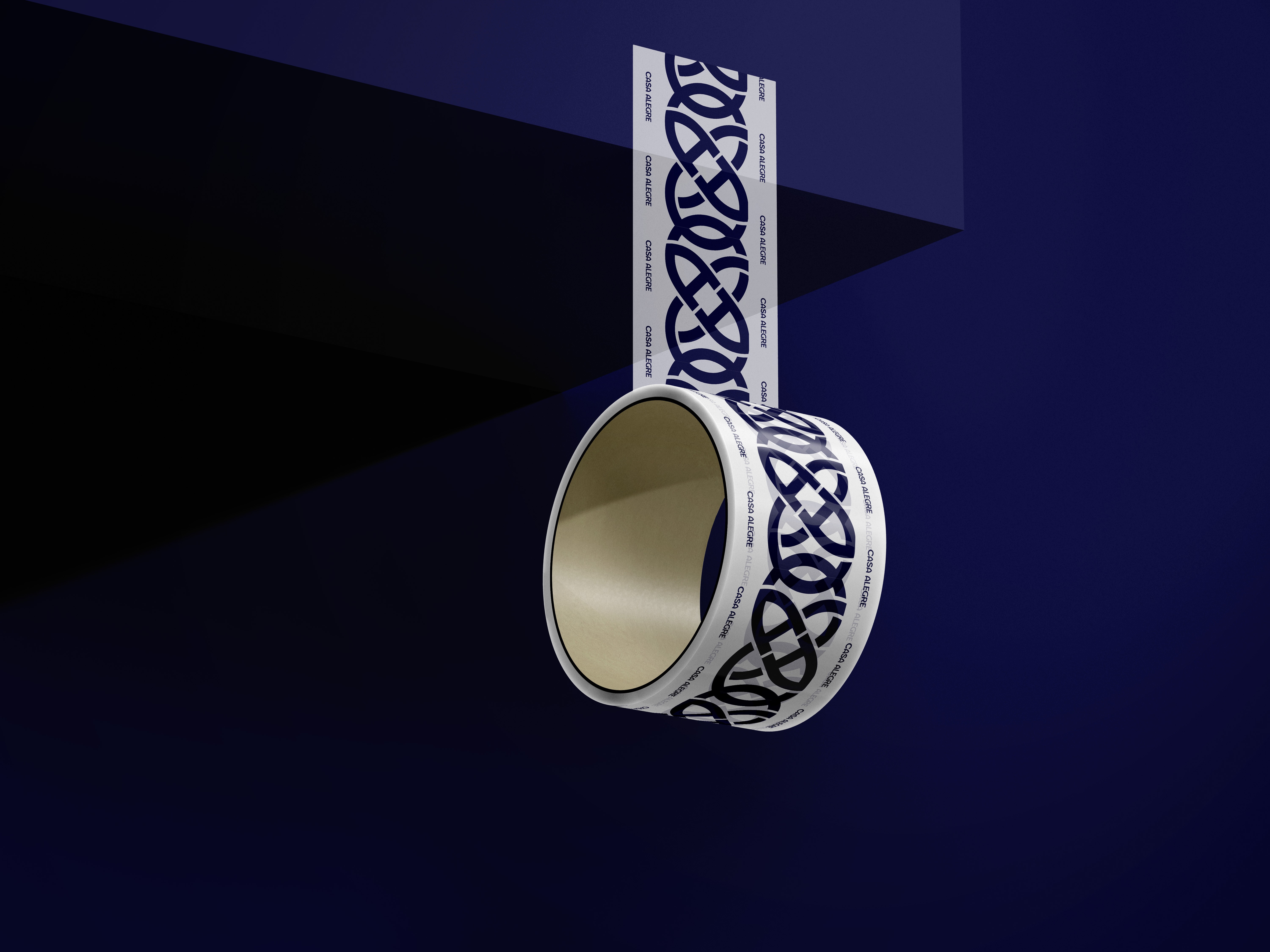
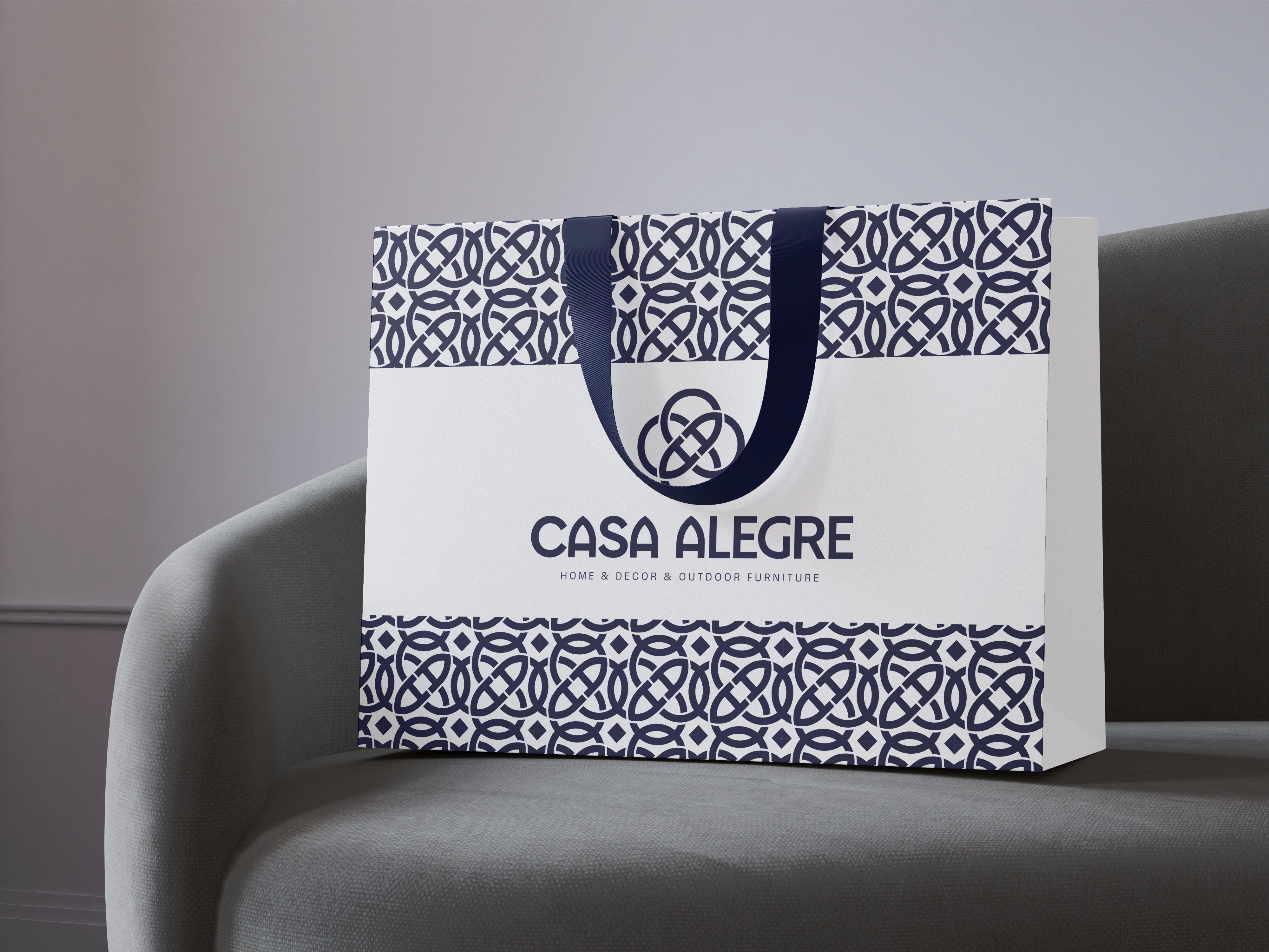
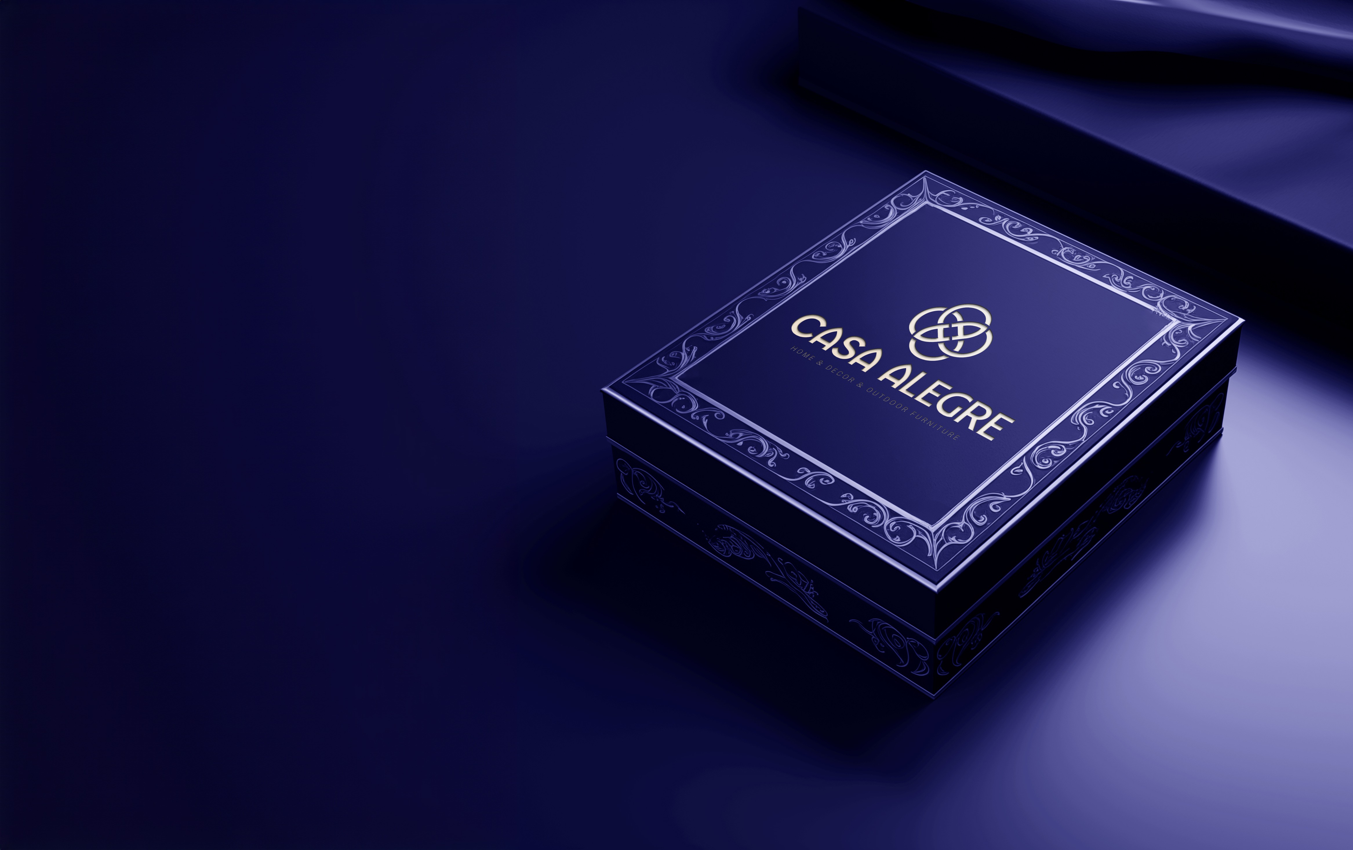
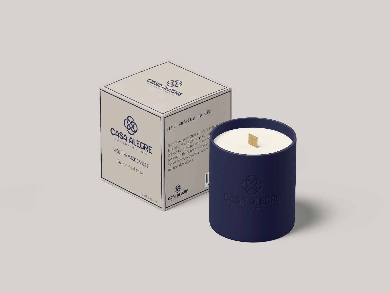
Every Touch is an Experience
We created a system in which the brand identity is carried with the same care across all touchpoints: the design language continued seamlessly through packaging, labels, bags, and product details. Each element was designed to support the brand’s refined simplicity.
The design language revealed itself not only in visuals but in every moment of the experience. Thus, Casa Alegre created a consistent and memorable brand atmosphere that brings together aesthetics and warmth.
More
More Works

Arowana
Arowana’nın Refleksinden Gelen Hareketin Yeni Formu

XLabs
Akıllı Yaşamın Yeni Nesil Arayüzü
More
More Works
Arowana
Arowana’nın Refleksinden Gelen Hareketin Yeni Formu
XLabs
Akıllı Yaşamın Yeni Nesil Arayüzü